You have found the personal portfolio of


I led and provided design direction on three of Quest digital products while supporting three agile dev teams. I collaborated with other UX designers, UI designers, UX researchers, CX, marketing, legal and compliance, product owners, business analysts, and developers in an Agile Release Train. My work includes content writing, experience workflows, storyboards, wireframes, prototypes, emailers, and updates to web and mobile app.

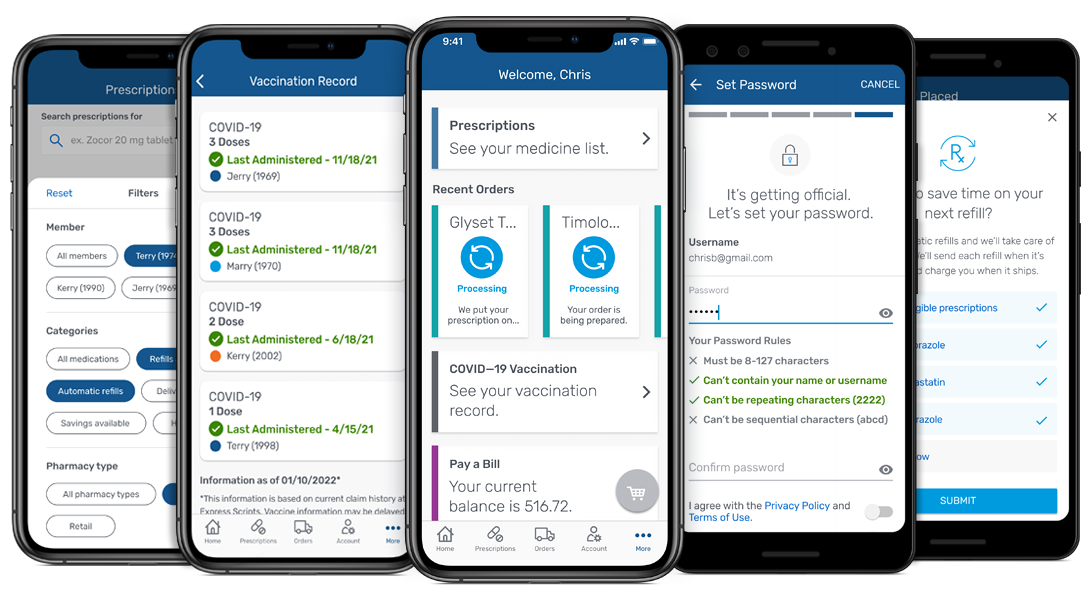
"The Express Scripts® mobile app is like a pharmacy in your pocket. You can order refills, make payments, and even set up reminders to take your medication."
I worked directly with a team of designers, content writers, researchers, iOS and Android developers and technical product owners in an agile environment. I also collaborate with website UX designers on website and app shared features.
I designed the end-to-end experience on new features, completed other projects that were in progress and provide UI updates on exsisting features. I designed options for A/B tests and built interactive prototypes for RITE usability tests. I was also the liaison between the Design System Team and the app team.
Some of the features I worked on include:
• Registration
• Two-Step Verification
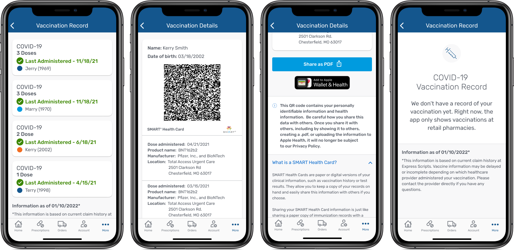
• Vaccination Records
• Cart Failure
• Delete Account
• Account Recovery
• Automatic Refills A/B Tests
• App Rebrand
When the Express Scripts mobile app first launched, registration was not a native feature. Members could register through the app, but it was the mobile website wrapped inside the app. My first project, at Express Scripts, was to finish designing out the native iOS and Android registration experience, building out iOS and Android prototypes for the UX research team to test with users and to provide final deliverables to the dev team.
Upon completion of the usability tests, our UX researcher presented the test findings to UX leadership for review along with minor recommendations. Final updates along with dark mode/theme visuals were made and presented to UX Leadership for final approval.
When working directly with dev team, I walked through all the visuals and the prototypes, answered any questions, help write stories, provide links to all the designs, export all icons, reviewed all the designs as they were being coded and provide any corrects that needed to be made.


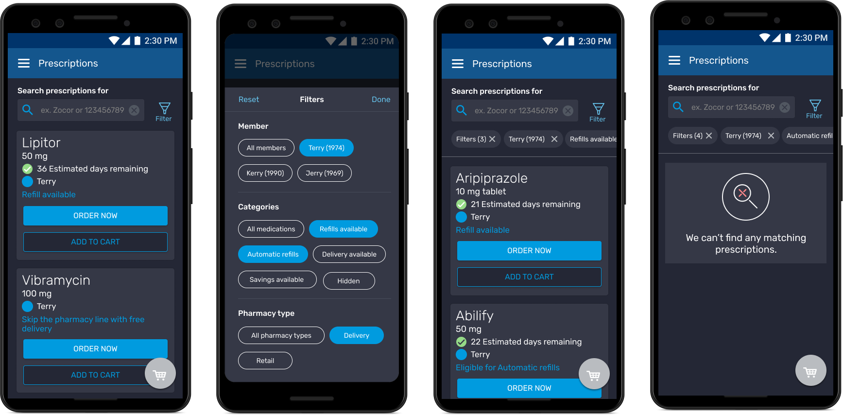

Working together with our team content writer and TPO, we came up with several possible options to increase enrollment in Automatic Refills.


The first test we ran was simple content changes in the primary messaging above the primary CTA button and in the primary button. These simple content changes had a positive enrollment increase in automatic refills by 134%.

An possible option I designed is add a native switch in the Prescription Details that the user could easily turn on and off automatic prescriptions.

Working with the Design System Team, I applied all new fonts, colors, icons and a few additional enhancements. All new components were made and all screens use auto alyout for easy updates and changes.
Working directly with the Android and iOS dev leads, we established a unified direction with the font styles for iOS, Android and the Figma visuals by using recommended styles from the iOS HIG as our reference.


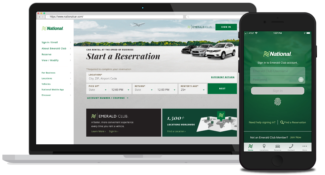
I worked directly with the Product Owner, Business Analysts and iOS and Android developers, in an agile environment to reorganize and redesign the National mobile app. I created an information architecture to plot out the navigation and organization of each section. I updated the UI for both iOS and Android to follow their native platform, referencing iOS's HIG and Material Design.
Since the launch of 3.0, we've made multiple updates, based on session replays, ForeSee reports and Adobe Analytics to improve the overall functionality, speed and reduce user struggles. Some of these improvements included overall navigation, rewards information, clarity around pricing details and error messaging.


In 2019, J.D. Power awarded National with the award for the Highest Customer Satisfaction for car rental apps.

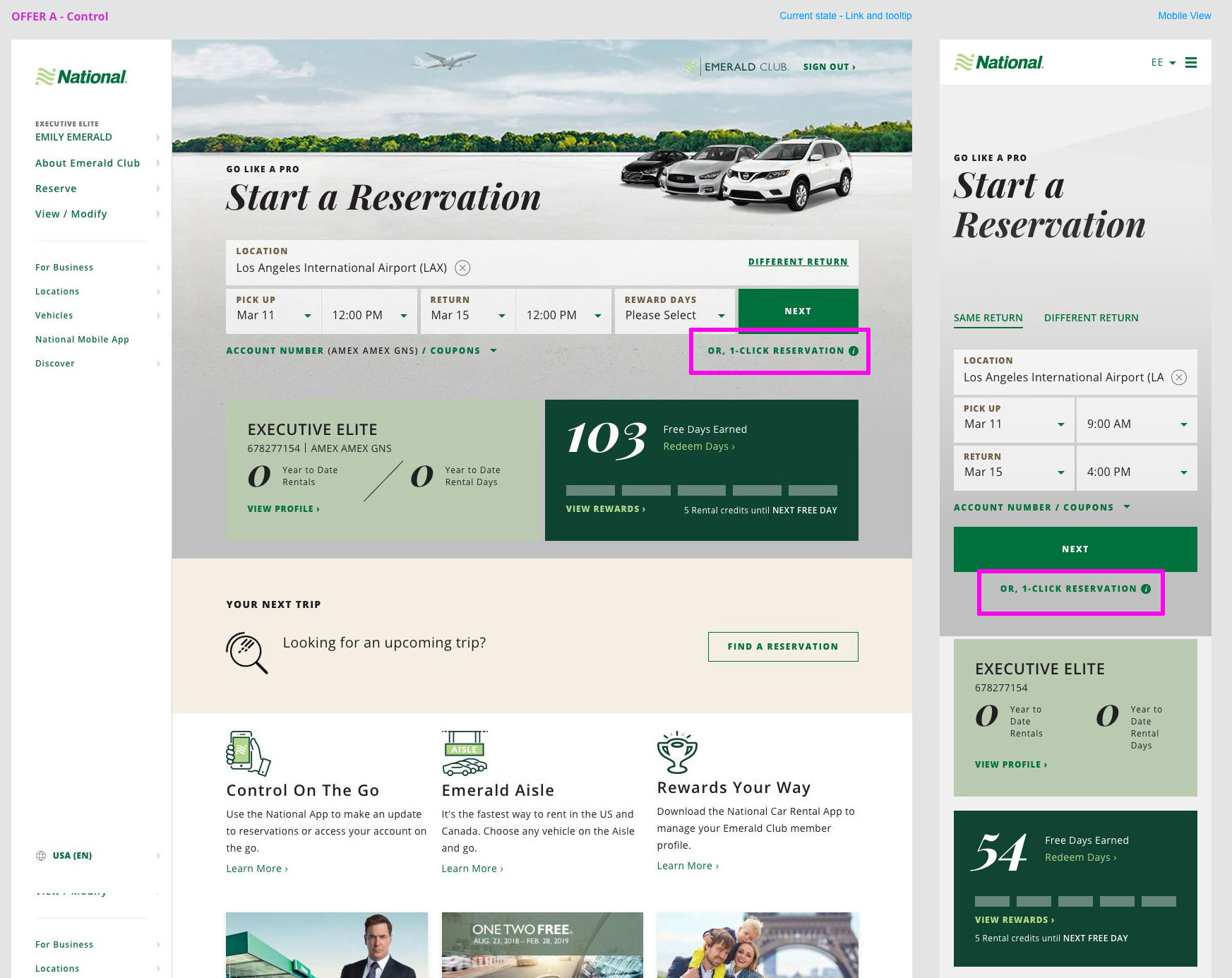
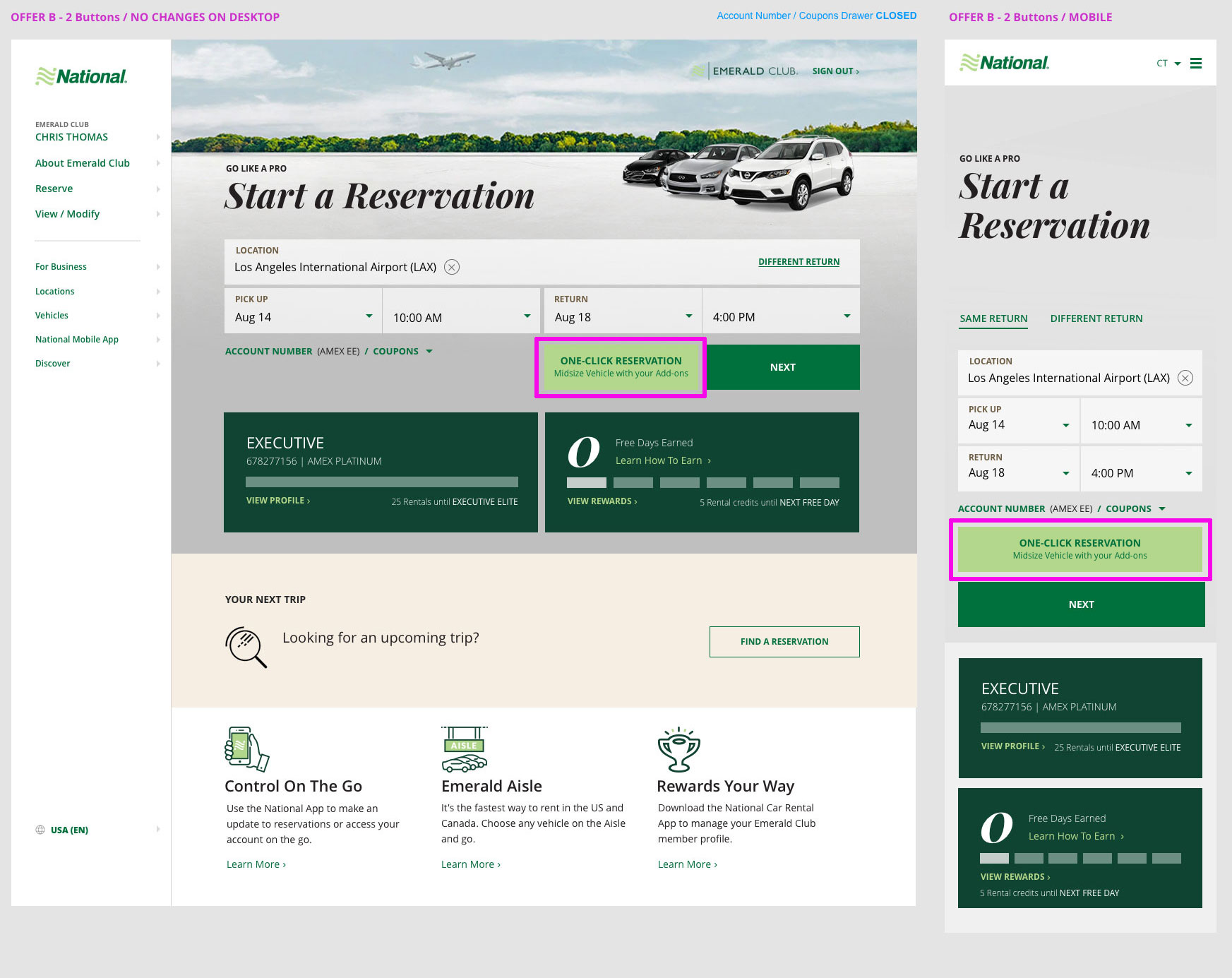
I worked with other members of the UX team as well as our Testing and Optimization Manager to run and an A/B test to vet out the best option to improve the discovery and clarity for the "One-Click Reservation" feature on National's authenticated home page.
On National's legacy site, the One-Click Reservation button was the primary option for starting a reservation. When updating to the National website, this feature was considered more of an option. After launching the site, users provide feedback saying the One-Click Reservation feature save them time and scrolling, especially for mobile users. Supporting National’s goal to give our customers “speed,” this feature was added back to helps customers find and use this time-saving feature. When the feature was added back, because of the location and design treatment, it was less prominent and harder to find that the legacy version.
After making several design options and running a few A/B tests, we found that option "B", updating the display of the One-Click Reservation to a large button with content increased the feature usage by 40% while taking customers 20% less time.

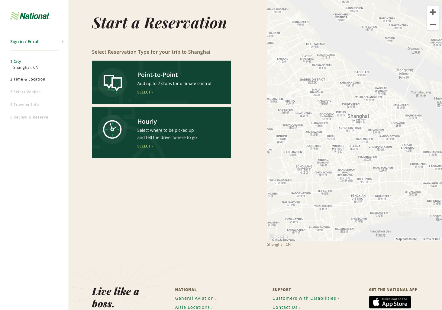
Working with a UX researcher, we put together a usability test and interactive prototype to test out the new designs for National's new Car & Driver service. The object of the test was to get feedback from users and make improvements by making enhancements to the design and remove and user struggles when trying to reserve a vehicle in China.
Designs were originally created by a outside agency, but the prototype and test questions were done in-house. Each user session was done remotely and observed. There were two rounds of tests with interaction made between each session.
After all the session were complete and updates made to the designs after the second round, the finding and recommendations were shared with the product owners and the outside agency.

Working with serveral different internal teams, I redesigned and reorganized all the rental confirmation and loyalty email templates. We organized the information in each template to place the most important information to the customer at the top, but also give more weight to dates, times and pricing. All templates were designed for desktop and mobile display.


Working with other other members of the UX team, I helped redesign the My Rewards & Benefits page for Enterprise Plus members. The objective was to reorganizes the content on the page so users could quickly and easily find the important information that pertained to them which included their tier status, point accrual, and program benefits.
Working with a UX researcher, we ran an iterative usability test on the new design and made updates based on user's feedback. These enhancements, noted below, were a major VOC & UX wins and scored well in user testing.


Working closely with several members of the UX team, we improved the overall usability of the My Rental page. This page provides reservation details on Current, Upcoming and Past Rentals. Based on user feedback and watching users struggle during session replays, we made updates to improve:
After the redesign, overall usability of the page was enhanced by the addition of filters for Upcoming and Past Reservations, clearer calls to action and consistent design with other areas of the site. These updates also improved the usability in mobile usage.


Working with members of the Product Owners Group, I helped redesign the landing page for corporate deep links to specific location pages. Based on user testing and optimization, usability improvements were made on the branch pages. These updates were identified as key areas that would also benefit business travelers using a deep link to start their reservation flow.
The updates to improved the overall usage of the branch pages by removing the large and moving the reservation widget to the top, displaying the location information, similar to the branch pages with a smaller map, displaying the location hours, pickup and after hours indicators and wayfinding for airport locations.


I worked with serveral different internal teams to redesigned and reorganized all the rental confirmation and loyalty email templates. We organized the information in each template to place the most important information to the customer at the top, but also give more weight to dates, times and pricing. All templates were designed for desktop and mobile display.


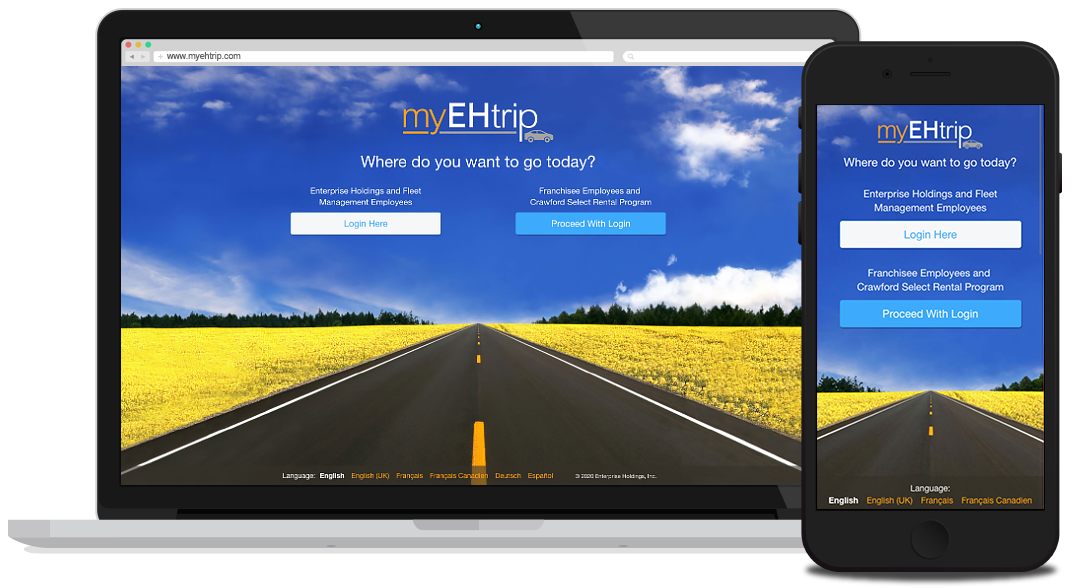
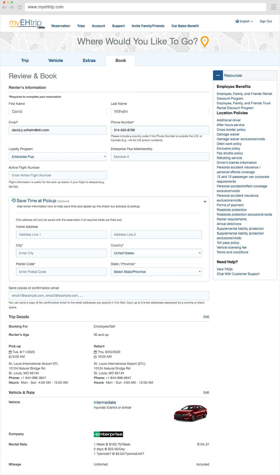
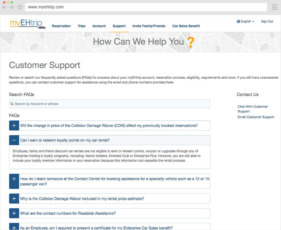
The first project I worked on at Enterprise Holdings, was myEHtrip. This site replaced Concur for the companies interal booking tool. The site is specially for Enerprise Holdings employees and their friends and family.
For this project, I worked with the product owner and an agile dev team in Sweden. I created the information aritecture to provide the organizationa and navigation for the site. I built out wireframes for each page based on the business and development requirements. The site followd the Bootstrap framework. After wireframes were completed and approved, I completed the site by provide all the UI elements and assests.
Iterative in lab usability tests were ran with Enterprise employees on the reservation flow. Improvements were made after each round based on users feedback and usage. The site launched and offically replaced Concur.






I’m a seasoned UX Designer and HFI-Certified Usability Analysts in St. Louis. I have a passion for creativity and usability and I enjoy creating thoughtful experiences that are built for everyone to use. I’m dedicated problem solver committed to turning complex ideas into simple, functional solutions that are memorable. I like looking at the big picture, imagining all the possibilities and seeing all the potential touch points as well as focusing on the little details that can have a big impact.
I create usable, accessible and engaging digital experiences via desktop and mobile web and native iOS and Android mobile apps by applying UX thinking, design principles and following WCAG accessibility guidelines to solve user needs and meet company goals. I create information architectures, wireframes, low & high fidelity visuals, interactive prototypes for team reviews and user testing, style guides, components that are consistent and holistic focusing on the user’s end-to-end experience. I work with designers, researchers, content writers, accessibility experts, business and product owners and with developers in agile sprints.
© 2024 Dave Wilhelm | All Rights Reserved.